
Walking into an art gallery on the opening night of a show is glamorous and invigorating. The atmosphere is both exciting and inspiring: people are dressed well, usually trying to impress dates or are attending with friends who share a common interest, art. A night full of energy and the gathering of a community discussing a beloved common ground means exposure for artwork and the artists who create it.
The year of 2020 introduced the novel Coronavirus which caused many industries to screech to a halt. The pandemic forced national and local governments to mandate social distancing restrictions to curb the spread of the virus by limiting potential exposure. The experience of displaying and viewing art was not deemed essential.

Total project time: 2 months
Original Scope: Create a product to help artists connect with consumers to generate more sales.
Team: I worked by myself on this project.
Constraints: iOS application
Extensive secondary research revealed that traditionally older wealthy folks frequent art galleries and museums the most. The biggest growing demographic actively attending and purchasing artwork in art galleries happens to be millennials. It was clear to me that my product needed juggle appealing to hip youngsters with a refined dignity suggesting trust and reliability to a more established crowd.

Artists, art seekers, and an art gallery owner entertained my questions and gave me key details I needed to understand how the art industry works. After wrapping up multiple interviews, I think my findings could best be described in one quote by a vibrant young art collector, Sloan. She said,

At the end of the day, my observations evolved into a few important insights that I narrowed down to an MVP list. Here are the juicy details:
After listening to people talk about their experiences viewing and purchasing artwork, I categorized all of the observations I collected into groups and was able to spot a few similarities. I developed an affinity map to organize my notes and help me make relevant connections. Every single note I took during all of the four interviews I conducted fit into one of these four categories:
To create my affinity map I used a bunch of post in notes, and jotted down interesting quotes and points that I though were remarkable while interviewing. While I interviewed I took great notes, and even recorded a few of the sessions for research clarity later on in the process.

The next task was sticking the post it notes to a door in my office, and re arranging them to fit into categories that became clear as the process commenced. Before I removed the post it notes I snapped a pic, and then created a nice, clean digital rendition in Miro, an online work space.


Empathy is a very important tool for designers to practice during the design process. I used empathy maps to chart each one of my users perceived relationship with my product. I put myself in the minds of my users and thought: what does the user think? What do they feel? What do they say? And finally, what do they do?
After turning observations into insights, I was ready to develop stories for who I imagined my users to be.


Finally, using my insights and my user stories, I was able to create a list of the most important usability factors. I called this my "MVP" list.

By rationalizing the thought processes of my users, I was able to understand a bit more about who I am creating this product for. During this process I was also able to rule out “gallery owner” as a user.

After figuring out what makes my target users tick, and gaining empathy for how they think, it was time to make a few personas. These personas allowed me to get into the perspective of the apps user built up by all the research I've done up to this point.
Age: 25
Gender: Female
Occupation: Painter
Status: SIngle
Audrey is a local artist who struggles to make ends meet, and is constantly showing her work for potential sales.
Audrey doesn’t have anyone to rely on for help financially. She teaches art classes on the weekends to supplement her income. Her attitude is always upbeat and she is very happy to have a job doing what she loves.


Age: 36
Gender: Male
Occupation: Business Consultant
Status: SIngle
Bob is a successful financial consultant, and travels a lot. Bob is currently single after a divorce and is looking for a partner. Bob has always loved art, and likes to develop life around artwork that inspires him. Bob likes to take girls to galleries to if they have relatable traits. Bob enjoys going out on the weekends and will always buy art if it inspires him.

How might we consider the needs of our users better? The answer is very simple, create a few problem statements to explore in depth throughout the remainder of the production process:
Brainstorming for this project was an easy for me - I think because also wear the hat of a fine artist, at any rate, I began where I always do - in my notebook.

After ideating for a few hours, I began to sketch very very simple concepts just to get some ideas on paper.
It was time to get organized! At this phase in my process, it was time to start mapping out my user's flows in order to complete key actions. At the end of this stage, I developed a few red routes that would eventually translate into the actual prototype I created for this product.
First, I considered the navigation of the application. It needed to be very simple. The focus should be on finding art quickly and striking conversations with artists that would eventually lead to sales.
Next, back to the sketchbook to create a sitemap.

Next, I created a digital sitemap to share and reference for the rest of the project.


Embarking in creating the design of the interface, I started with simple sketches. I tried to keep each sketch under five minutes to avoid getting lost in details. Keeping the focus of my sketches on insights derived from my primary research was a guarantee that my project would meet my user’s needs. I am still using the user flows for this step, but since I developing screens to match the flows, and they are very basic fundamental tasks for the app, I referred to them as red routes.


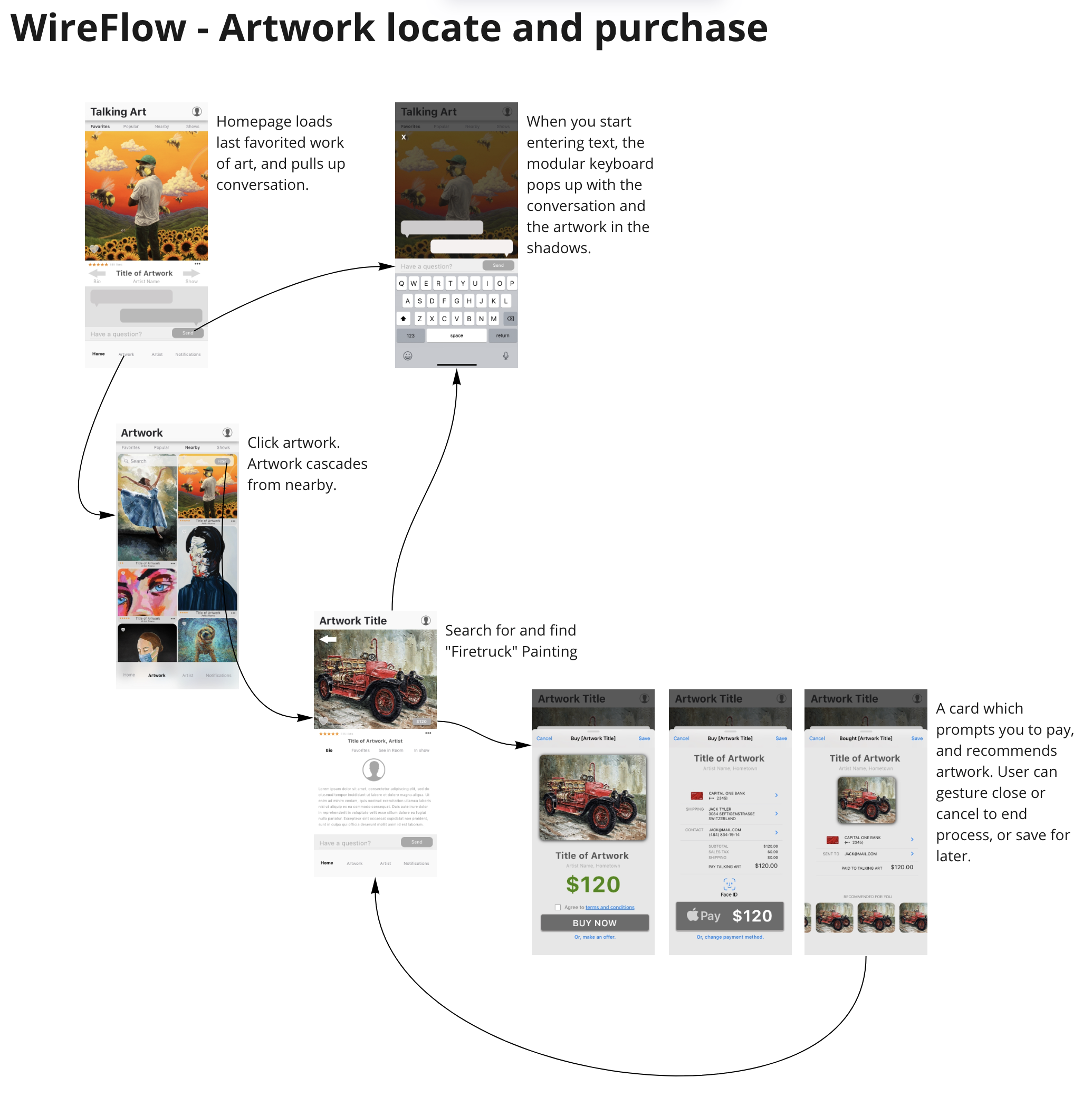
Developing my vision further meant transforming my sketches into digital wireframes of user stories. Locating artwork, communicating with the artist, and finally purchasing a work of art is one example of a user’s journey that I mapped out. Curating a new show and sharing it to multiple social media platforms in one click is another flow that I focused on. My wireframe technique was to show hierarchy using different values of grayscale and proportion.

After the wireflows were finished, I rounded up a few local artists and a couple of acquaintances to conduct a usability test on the designs at this point. This was a very important step that validated my decisions. There were a few screens that changed significantly because of the initial usability test. Because of COVID restrictions, all of my usability testing was done remotely, which presented some interesting barriers!

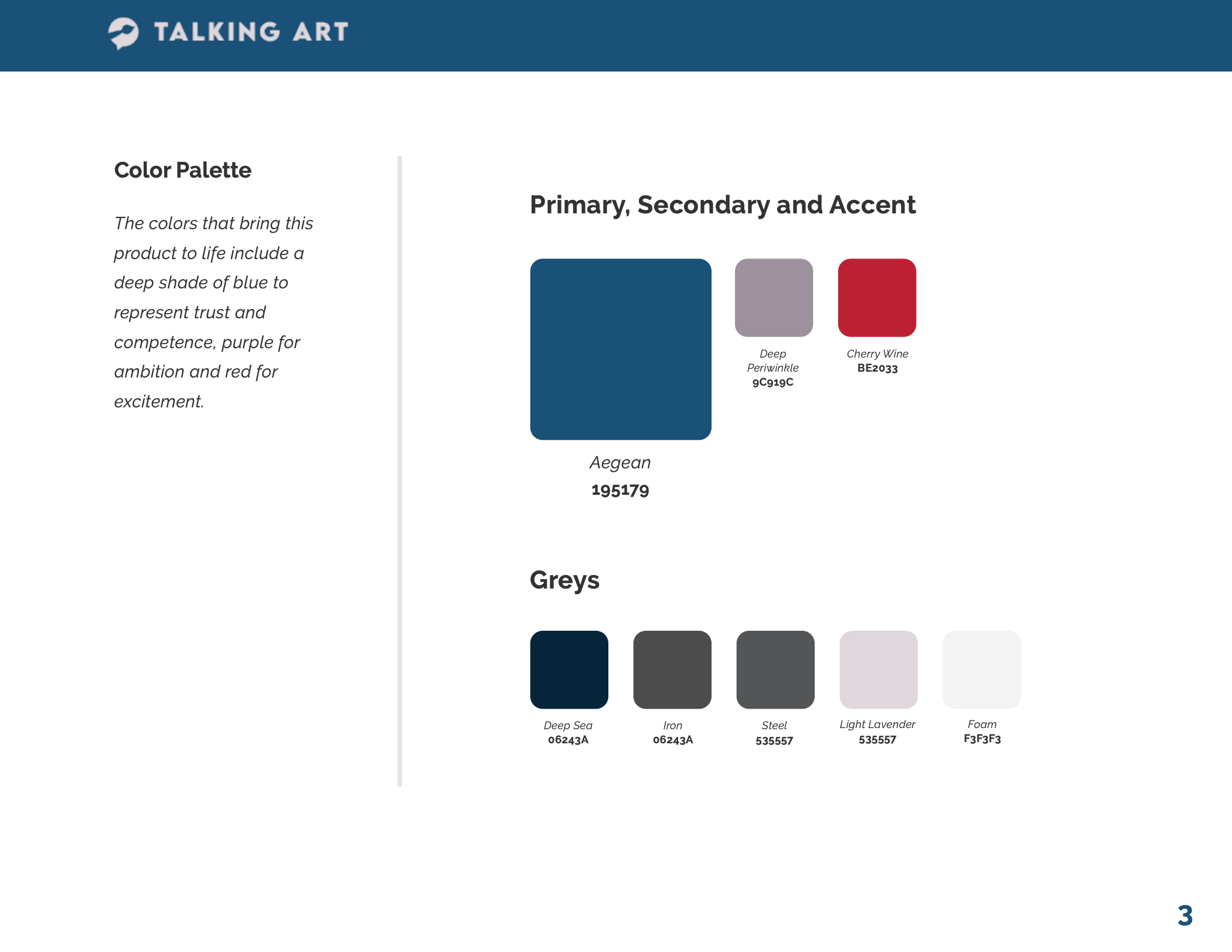
Style, cutting edge features, and an easy going workflow were in mind when developing my application’s brand standards. The logo was intentionally designed to be bold and easy to read, with an icon that is as straightforward as it is simple. Shades of blue were used in the application to denote trust and reliability, and differing tints of grays were established to establish visual hierarchy though contrast.
Interface elements were designed to be simple and straightforward, just as the values of the product relay. The grid layout in place was done with intent and purpose, giving the elements that come together plenty of space, and allow for a wide viewfinder to observe works of art. Proxima Nova, a simple and understated typeset, was employed giving the aesthetics of TalkingArt some personality albeit simple.


Style guide, wireframes, sketches and personas were tossed into a cauldron to simmer while I patiently infused the ingredients until my design soup matched my vision.
A usable, stylish and visually simple interface.


After importing Sketch screens into InVision studio, then creating animations for features and screen transitions, the prototype was born.

Check out this video of the prototype in action:
Before I reiterated after the first usability test, the participants I chose were confused about the home screen, the lack of buying features on the work of art screen and were concerned about the payment workflow being secure.
Here is a video of the prototype after iterations:

☝️☝️ Back up to the tippy top! ☝️☝️
Even if it has nothing to do with work, come say hi! 😊