
I can’t think of a single person who isn’t subscribed to a music streaming app. Having access to a practically infinite library of music appeals to people resulting in a service becoming a necessity. We live in an age that demands efficiency and speed. We strive to have a soundtrack for every occasion: to elevate our experiences in life with the stimulation of the expression of another.
There are so many successful giants to compete with that I carefully considered prior to conceptualizing a product that would make people want to tap subscribe without hesitation. Current applications seem to have their signature features that their user’s cherish. One product might have a wonderful experience in regards to collecting and organizing media, while another might customize desired playlists based on mood and environment.

Subscribers seem to be loyal to their services of choice: I must develop an inviting and familiar user interface with well defined and advanced user experience strategies to elevate my users experience with streaming media.
Exploration is key.
You would be right to assume the name of the app was derived from the apps function, to explore. I have always strived to find a system that allowed me to access more enjoyable music more often, and easier - instead of relying on burnt out, dusty music collections that I all too often go to out of pure laziness. Beginning my research for this project was two fold for me. It was clear that I would either find a feature in a product that would allow me to find my desired media in a better way, or I would find a system to create something new that met my expectations of a streaming app.
I am a user experience designer who spends hours a day behind a computer screen and music is a very important part of my process. I began this project with a mission to provide streaming subscribers with a valuable alternative to products that exist on the market today.


Total project time: 6 weeks
Original scope: Convert more free accounts to premium account by upgrading features.
Team: I worked on this project myself.
Constraints: iOS application.
Xplor media, a startup company launched a media product two years ago. It is a free model that has a web-mobile experience and a mobile app for both iOS and Android. The company's business strategy was to first build a user base by offering a free product, and then evolve the feature set so they could monetize on a premium product.
My goals were to create a product with better features than the free experience and to give users the opportunity to upgrade to a better product, users will pay the subscription fee.
The product attributes given by the product manager:
The product manager also provided me with a sketch file with notes and directions as well as product wireframes.

With the daunting task of developing a product that users would cheat on their preferred media streaming outlet with, and subscribe to, I began to organize and synthesize secondary research to energize decisions for my own primary research. First, I took a long hard look at a few of the most popular products on the market today. I decided to evaluate Apple music, Amazon music, and spotify.
Since I was partially motivated by my own desires to discover a new product to streamline my experience locating new music, I developed an objective to follow. I studied the three applications mentioned above by categorizing notes in three columns - likes, dislikes and action items. Here is a visual showcasing how I organized this phase of my research:

After analyzing the industry leaders for media streaming, I turned my focus onto my products target users. I discovered that the demographics that stream the most media are in the age range of 16-35, and that most users steam using multiple applications for different reasons. XPlor media will
This was probably the easiest part of the process, considering everyone I know uses an application to stream music. There are a few characteristics I had in mind when considering participants. I wanted to test people who were very good with the products of their choice, and have a strong loyalty to their brand of choice. I needed my participants to know why, right away they used the app that they did. I wanted to rely on my participants to showcase why they use their app, while questioning them about features that might interest them that their current streaming app doesn’t have.

I chose participants who subscribe to a premium music streaming app. I wound up with 5 individuals after running a screener interview focused on locating Xplor’s target audience; young tech savvy people who spend a lot of time streaming content. Lastly, it was very important to me to interview app subscribers from a variety of products.
The first part of my primary research centered on intentional observation. I wanted the participants I chose to sell me the app that they use to experience streaming media content. I opened up my interview asking them what their favorite features were and allowed them to show me how they complete tasks with their subscription service.
The next step in my process was the informal interview. After recording all of the positive notes the participants expressed during the observation phase, my questions concentrated on discovering media streaming alternatives they utilize to complete their content consumption. I used this time to explore my participant’s opinions about how to improve their premium streaming service, and what features an app would have to possess to get them to make a switch. Finally, I asked questions about their experience as a new user with the app; and their trial period

"I won't switch products because I have so many albums in my library with Pandora. "
Fresh, new and modern to attract a younger and more tech forward demographic.
I found a few examples of UI that I liked, some colors and typography. I chose a dark theme so that the artwork would pop on screen. I picked an electrifying blue color as my primary accent color, and chose attractive modern sans serif fonts.

Using Miro, a web-based whiteboard, I created digital post-it notes displaying impactful observations gathered during my primary research. Next, I made virtual piles of post it notes that shared similar themes. I ended up with three main categories:
A few other categories I created include: Why I won’t switch, Conventional media consumption, and using other platforms. Check out my affinity map below!

After I created my affinity map and organized all my data, things started to become obvious about what direction I wanted my product to go and what sorts of features trial members would subscribe for. With a clear mind and no assumptions made, I moved forward by creating personas.
I created three personas that I felt had needs that encompassed a decent majority of my users. I think conducting research with as much human empathy as possible is a key factor in developing a product that excels in usability. My personas included:

I generated 5 “how might we” questions to help me prioritize critical elements that I felt needed to be addressed. At this point in my process, I know how the apps work through secondary research, I’ve experienced the UI first hand with primary research, got to know the competition’s most adamant users' likes and pain points, and organized my data in a way that is digestible for me. The questions that follow are important to my process because they state my direction, and suggest exploration.
My decision to start brainstorming at this phase in my sketchbook was fully intended to aid in developing my research further, while establishing a visual guide to ease my process when prioritizing the user interface.
In order to brainstorm for this project, I came up with a few keywords that described the sort of product I wanted to make. Xplor needs to be Adventurous, entertaining, fresh, and cutting edge. I began to list words that were similar to my keywords, then I began doing quick sketches of those words. I kept the sketches down to around 20 seconds, and I tried to do 8 different thumbnails for each keyword. This exercise helped me think with both sides of my brain, and really helped me to dig a little bit deeper while brainstorming.

After I felt confident with the exploration of the keywords I selected, I wanted to dive head first into dissecting the elements that I would focus on to influence my users to subscribe to Xplor Premium. I used a method called SCAMPER. SCAMPER is an acronym, and the letters represent (S)ubstitute, (C)ombine, (A)dapt, (M)odify, (P)ut to another use, (E)liminate or elaborate, (R)everse. For each how might we statement I came up with, I though of one SCAMPER each. This process really helped me to explore every element of my research in great detail while being focused on deliverables.
After secondary research, finding insights with primary research, developing personas, posing questions to explore solutions, and developing direction through brainstorming: my problem statements developed without difficulty. Here is an example of one of my problem statements in development:
The last phase of my research was developing user stories. I created a set of four stories from my user’s perspective that described how my platform can successfully complete a task for them. Here is one of my user stories:

It was very important to keep the action of transacting resources for a premium experience throughout the entire process up until the very end.
Before considering features, and user interface elements, I developed 3 tasks that I considered to be crucial for the app, called red routes.
1. After onboarding is complete, select the genres you are interested in, find a new artist to add to your liking, and add the suggested users you want to your network. Start listening to new music, and add the user who published the playlist. Follow the link to subscribe to the premium service to unlock unlimited network additions.
2. After onboarding and setup: play your most recently played song again. Notice an alert that states a few of your friends are attending a live event on the application. Join and watch for the maximum allotted free version duration, then follow the subscription workflow.
3. After initiating a road trip to Seattle and putting the platform in car travel mode, you decide you want to input the destination so that more local music from Seattle plays to get you in the mood to experience the culture. Input the destination and apply the parameters to the mix. Upon returning home, the application trial runs out for destination car mode. Follow the subscription workflow.
I carefully and thoughtfully created tiles that represented screens, and shapes to represent actions with arrows to show the flow a user would go through to complete each red route.

My goal when creating my user flows was to get the tasks completed in the fewest amount of steps possible. I wanted to keep my attention hyper focused on the specific tasks I developed without being distracted by the complex nature of conventional music streaming platforms.
sketching out very basic renditions of my key screens developed though user stories and flows produced some useful low fidelity versions of my application. I sketched out all of the screens in my red routes quickly and made changes to elements to develop a hierarchy and an easy path for users to follow to tackle problem statement tasks.


Setting up my file on Sketch consisted of picking a device to design for, and uploading all of my pencil sketches to use as a reference. At this point, my goal is just to make my sketches interactive to that I can begin doing usability tests to validate my efforts up to this point.
With very basic user interface elements and design systems in place, I was able to test my product to get feedback on usability and develop potential iterations to make my product more efficient. I had just started a new marketing venture with a local bar, so I took advantage of being a new face and requested a few people test my product. I gave each user tasks that resembled my red route tasks and recorded the audio of the interviews on my cell phone. Later, I went home and synthesized the results into a report. In this report, I highlight any opportunities to iterate my product before rendering higher fidelity versions.
On participant mentioned not inherently knowing how to interact with an element, which lead to an iteration adding a contextual menu to a screen.
sketching out very basic renditions of my key screens developed though user stories and flows produced some useful low fidelity versions of my application. I sketched out all of the screens in my red routes quickly and made changes to elements to develop a hierarchy and an easy path for users to follow to tackle problem statement tasks.


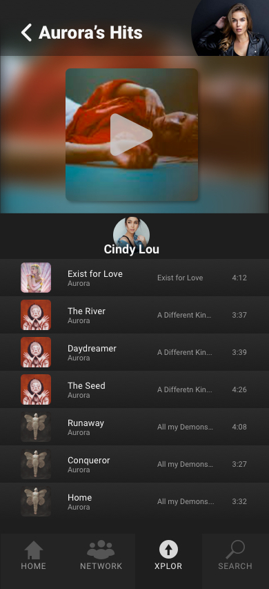


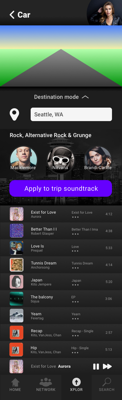


After finishing high fidelity mock ups & the first round of prototypes, usability testing and reiterations resulted in a usable and efficient music streaming app. Take a look at the three different red routes below.
☝️☝️ Back up to the tippy top! ☝️☝️
Even if it has nothing to do with work, come say hi! 😊